- General
-
 Ideeën
0
Declined
Dialog Box
i think Decline potentially unwanted offer should be the first optin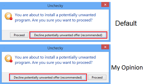
Antwoord
and you can change the text : "Decline potentially unwanted offer (recommended)" to : "Decline (recommended)" and use less repetition
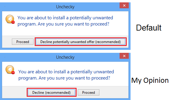

It was changes to be longer because people tend to click on things that are larger. It used to be shorter (and Proceed longer), which wasn't quite right...
Left/right is arguable, I prefer right.
Left/right is arguable, I prefer right.

Under review
I disagree. I chose the "correct" option to be on the right because that's how it usually is in installers. The "Next >" button is on the right, and the "< Back" button is on the left.
About shorter code and repetition: I chose to do it this way so that even if you don't read the main text, you understand the decision you make by at least reading the text on the buttons.
I'll leave this open for a while to see what other people think.
About shorter code and repetition: I chose to do it this way so that even if you don't read the main text, you understand the decision you make by at least reading the text on the buttons.
I'll leave this open for a while to see what other people think.
Antwoord
Declined
I disagree. I chose the "correct" option to be on the right because that's how it usually is in installers. The "Next >" button is on the right, and the "< Back" button is on the left.
About shorter code and repetition: I chose to do it this way so that even if you don't read the main text, you understand the decision you make by at least reading the text on the buttons.
About shorter code and repetition: I chose to do it this way so that even if you don't read the main text, you understand the decision you make by at least reading the text on the buttons.

Customer support service by UserEcho


About shorter code and repetition: I chose to do it this way so that even if you don't read the main text, you understand the decision you make by at least reading the text on the buttons.